
Digital Mental Health Platform .
A mental health companion app for UN Peacekeepers.
case study
Role
Lead UX Designer
Duration
6 Months
engagement type
Team Project
Figma
tools
Project Overview
Problem Statement
UN peacekeepers often face high-stress environments and trauma, leading to mental health challenges such as PTSD, anxiety, and depression. However, limited awareness, stigma, and concerns about confidentiality prevent them from seeking necessary support. Many worry about career consequences or feel uncertain about where to seek help. Additionally, those who do receive assistance struggle to track their progress, making it difficult to gauge improvements and maintain their well-being effectively.
Objective
Design an intuitive self-assessment app for UN peacekeepers, providing personalized mental health resources to manage stress and well-being.
Target Audience
UN Peacekeepers on Mission.
My Contributions
UX Research & Strategy
Stakeholder Engagement
Wireframing & Prototyping
Design System Setup
Usability Testing
UX Quality Review & Feedback
Task Allocation & Prioritization
Research & Discovery
Stakeholder Engagement Plan
We engaged with stakeholders through bi-weekly meetings from the project's inception, gathering insights on their roles, vision, goals, and expectations. Through direct discussions, we also explored their current challenges, user groups, and expert connections, shaping our approach to meet their needs effectively.
Engagement Objective
Align with stakeholders' vision and interests to ensure project success. Establish clear communication, relationships, and success criteria for effective collaboration.
UX Maturity
Stakeholders value UX but rely on designers for implementation. Require regular updates.
Key Concerns
Accessibility (multilingual, lightweight design), Privacy (no personal data collection), Engagement (self-assessments, awareness), Timeline (short release window).
Communication Method
Weekly meetings (twice a week), email updates, live demos.
Engagement Level & Actions
Regular check-ins, user research, accessibility & privacy improvements, feature validation.
Business Goals & KPIs
Goals
Increase mental health awareness among uniformed personnel.
Encourage early help-seeking behaviour through self-assessment tools.
De-stigmatise mental health issues by making information easily available.
Ensure accessibility and inclusivity through multilingual support and customisation.
10k+
Downloads
(6 months)
80%
Increase in mental health engagement
(12 months)
25%
Reduction in perceived stigma
(12 months)
15%
Increase in overall utilisation
(12 months)
KPI
Intensive 2 Week Research Sprint
Since we couldn't connect directly with the real users (UN peacekeepers on missions), we relied on secondary research :
Interviews with 2 subject matter experts (mental health professionals working with UN personnel)
Secondary research through published studies, reports, and articles on mental health challenges faced by UN peacekeepers, day in the life of UN peacekeepers.
Competitor analysis
In the future, we could incorporate indirect user feedback through post-mission surveys or anonymized data analysis from support teams.
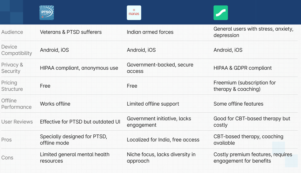
Competitor Analysis
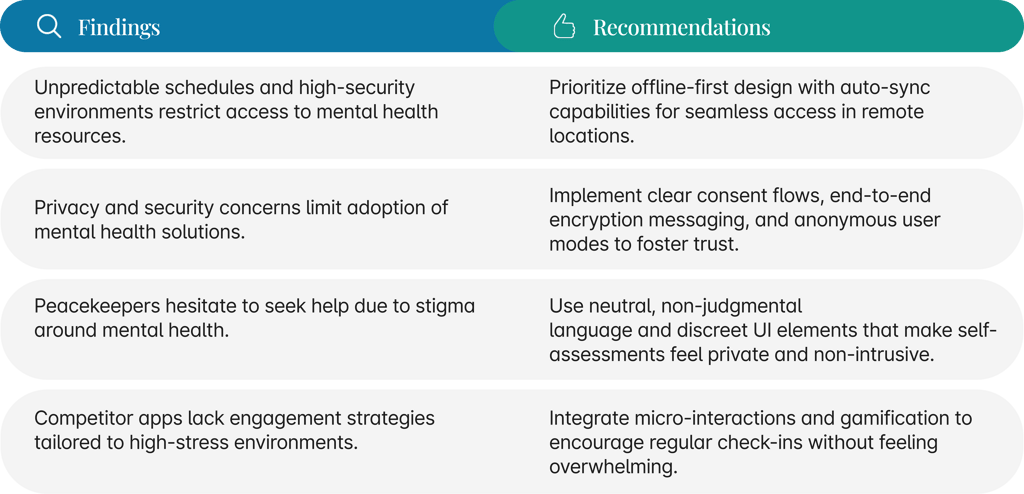
This analysis compares Manas, PTSD Coach, and Sanvello based on audience, features, privacy, pricing, and offline performance. Each app has unique strengths—Manas focuses on the Indian armed forces, PTSD Coach is specialized for trauma recovery, and Sanvello offers CBT-based therapy. Understanding these competitors helped identify opportunities for improvement, such as engagement strategies and accessibility.
Proto - persona
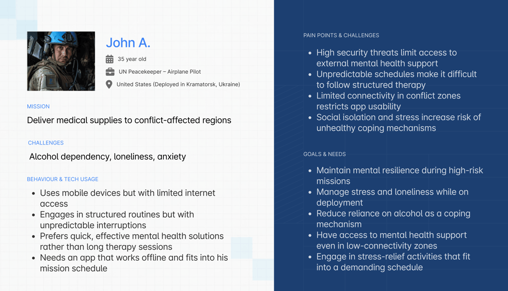
Proto-personas were created using insights from expert interviews and secondary research to capture key user needs and guide early design decisions.
Key Findings & Recommendations


Define UX Strategy & Key Features
UX Strategy
To empower uniformed personnel worldwide with accessible, user-friendly, and personalized mental health support through digital innovation, ensuring timely intervention and continuous well-being—regardless of their location or mission constraints.
Goals :
Integrate Mental Health Strategy, annexes, and essential resources within the app.
Ensure a user-friendly and easily accessible interface.
Offer multilingual support for wider reach and inclusivity.
Vision & Goals
Success Metrics
Engagement Rate – % of users engaging with self-assessments & resources twice a month.
Task Completion – % of users completing key actions without assistance.
Satisfaction Score – Avg. user rating on ease of use & accessibility.
Design & Development Strategy
Agile development with continuous feedback.
Modular design system for scalable expansion.
Cross-platform support for Android & iOS.
Integration with UN mental health resources.
Key Design Principles
User-Centric Approach: Design based on peacekeepers’ real-world needs.
Offline-First Functionality: Full usability in low/no connectivity zones.
Minimal Cognitive Load: Simple UI with fast access to essential resources.
Privacy & Security: Anonymous assessments and encrypted data storage.
Gamification & Engagement: Progress tracking and micro-rewards to drive usage.
Usability Criteria
Self-Assessment Completion Rate
Average time taken to find and engage with mental health resources.
Time required for first-time users to navigate the app independently.
Compliance with WCAG standards, multilingual support, and ease of use for diverse users.
Percentage of peacekeepers regularly returning to use self-assessments and training modules.
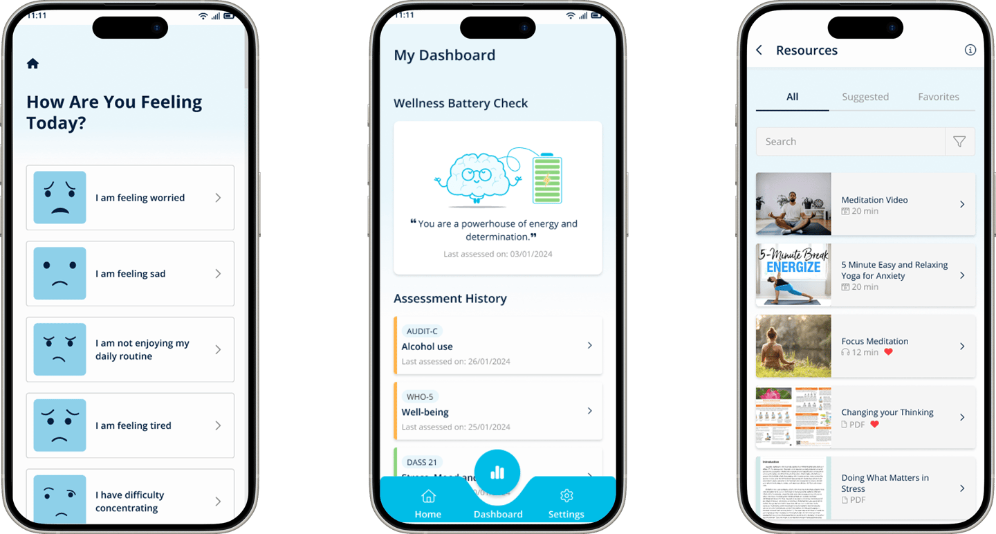
Key Features Definition
Self-Assessments
Reminders for self assessment
Accessible mental health resources
Progress Tracking
Gamification (Badges, Streaks, Rewards)
Offline Access
Multi lingual support
Solution Development
Information Architecture


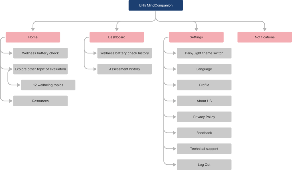
Task Flows
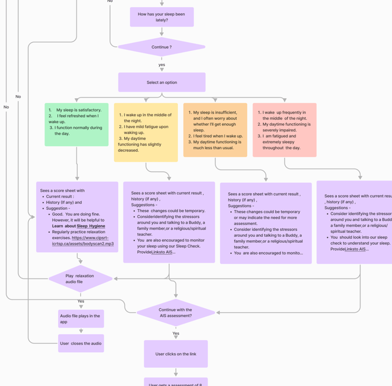
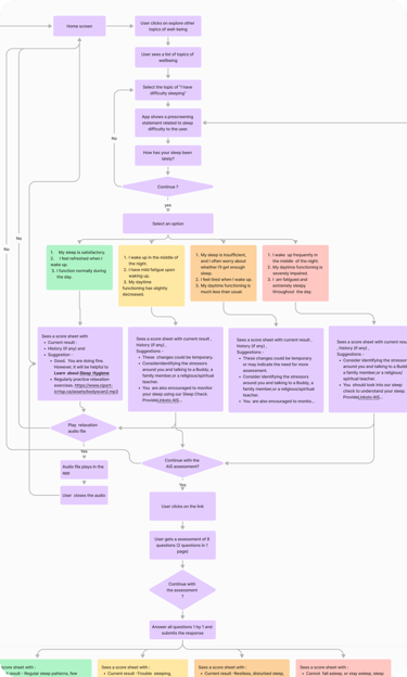
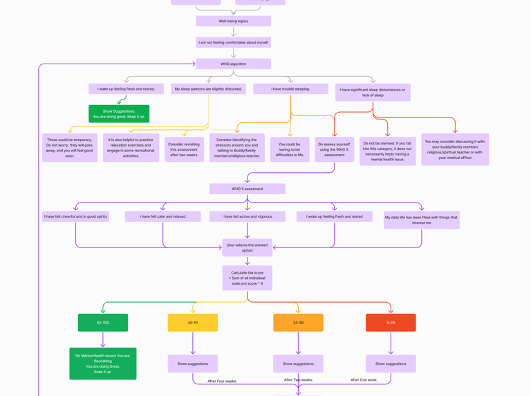
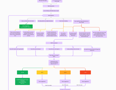


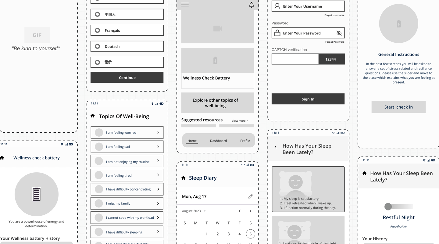
Wireframes
We created low-fidelity wireframes to map out the core user flows, ensuring intuitive navigation and seamless access to mental health resources.The wireframes focused on simplicity, accessibility, and efficiency, laying the foundation for a user-friendly experience before moving into high-fidelity designs.
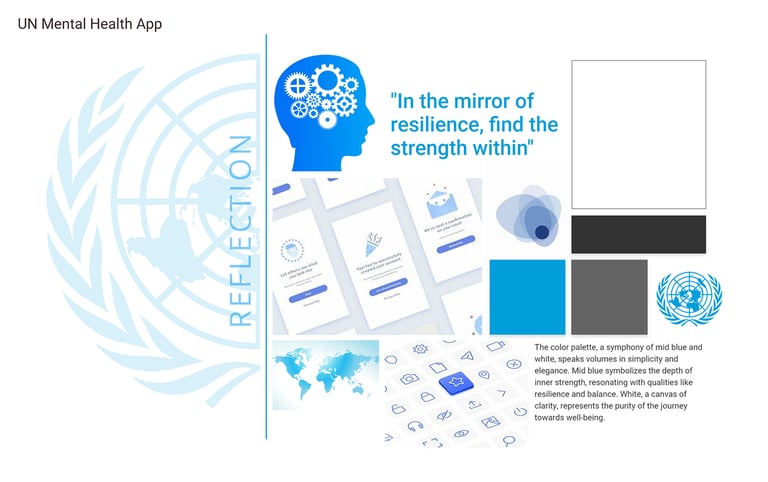
Mood-board Conceptualisation
We created three mood board options to align with the stakeholders' vision, incorporating diverse visual styles. This approach helped refine the color schemes, typography, and overall aesthetic. The final selection was based on votes from stakeholders and mental health experts, ensuring it resonated with both users and project goals.
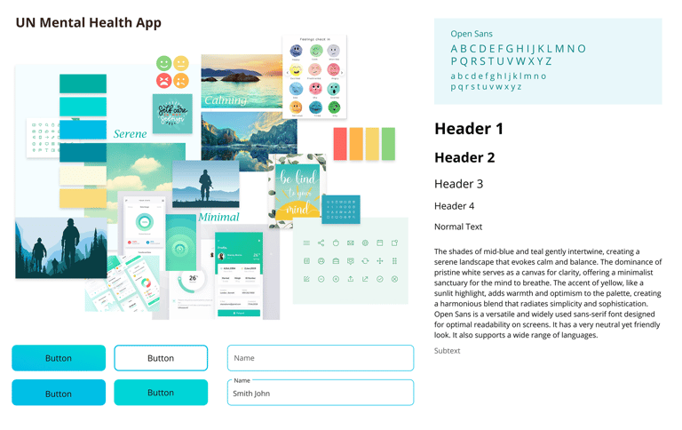
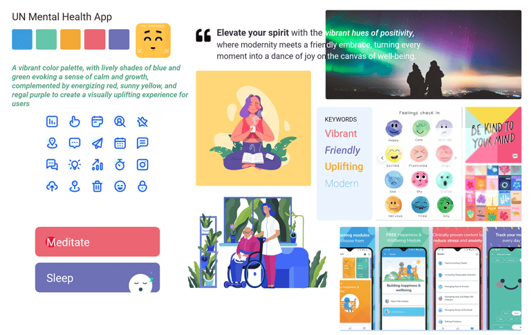
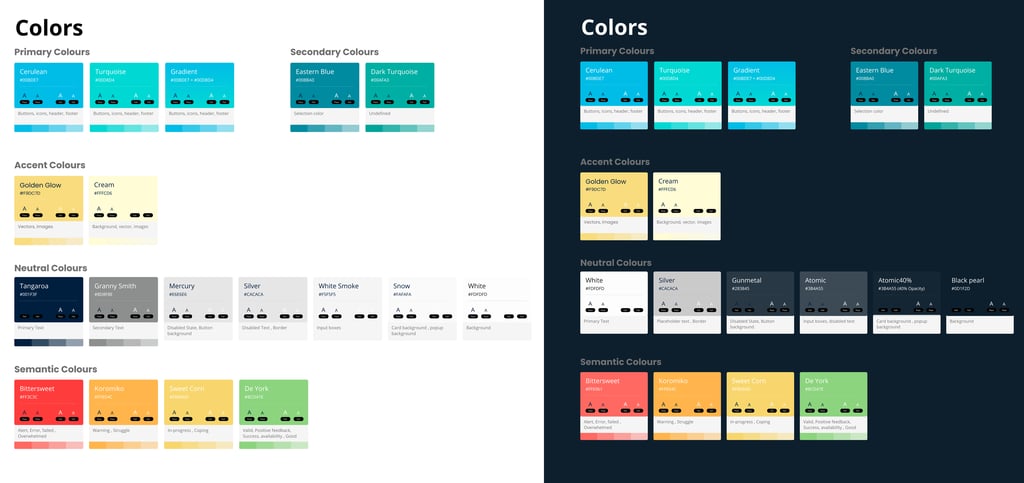
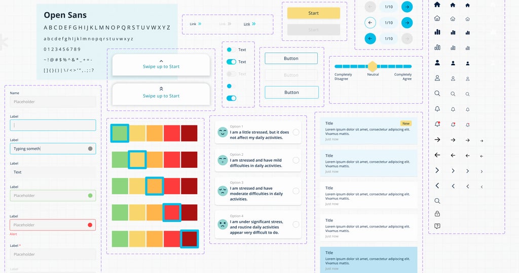
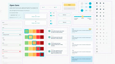
Design System Foundations


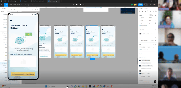
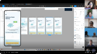
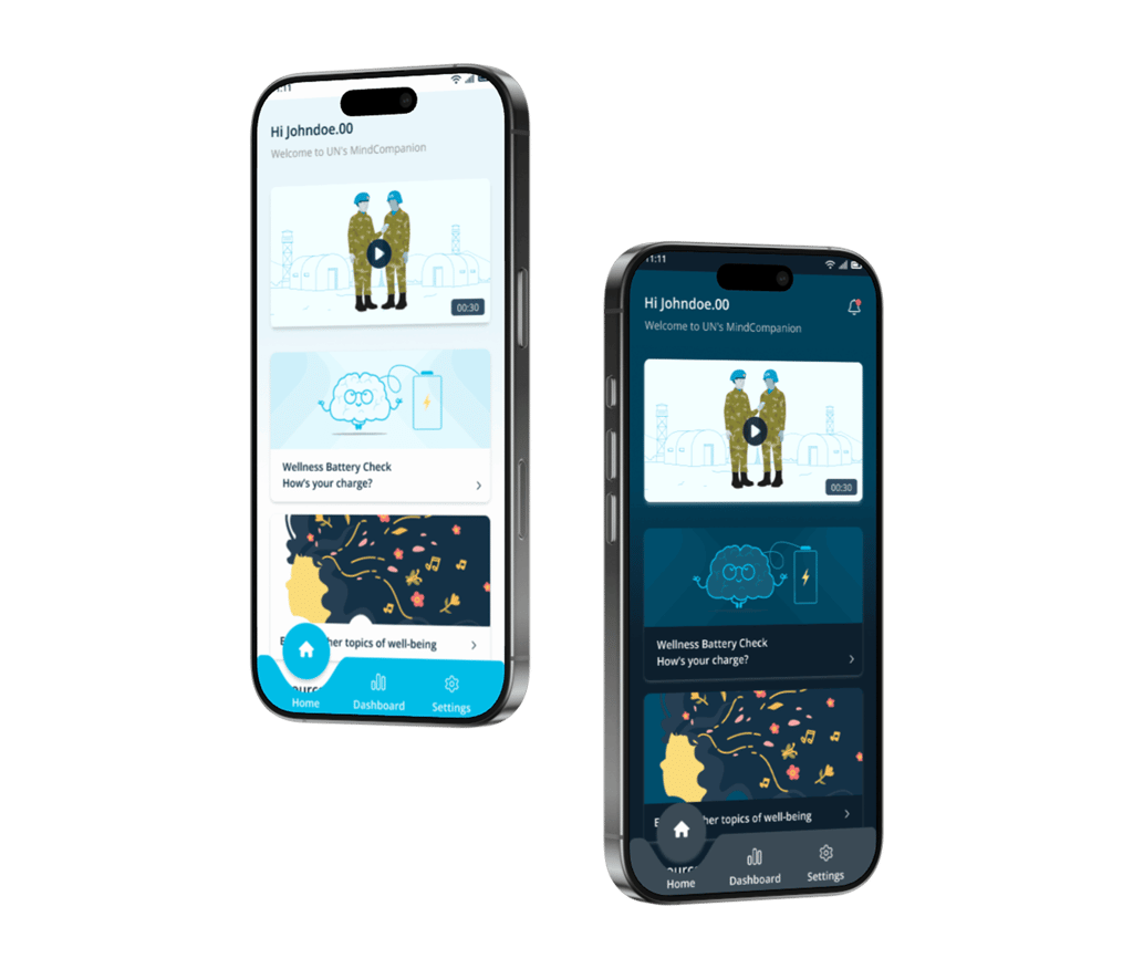
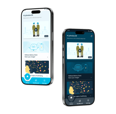
Final Mockup
The final mockups were refined based on stakeholder feedback, usability best practices, and insights from mental health experts.
The design ensures a user-friendly, accessible, and visually engaging experience while maintaining alignment with the UN’s mental health support objectives.

Field Usability Testing
Since usability testing was conducted post-implementation, we focused on gathering real-world feedback to refine the experience.
Testing Approach
Shared the application with a selected group of users.
Observed user interactions and collected qualitative feedback.
Focused on ease of navigation, accessibility, and task completion.
Key Areas Evaluated
User engagement with self-assessments and resources.
Effectiveness of navigation and information hierarchy.
Clarity of content, prompts, and interactive elements.
Usability Testing & Iteration
Feedback & Iterations
Identified usability issues such as information placement and feature accessibility.
Prioritized improvements based on user pain points.
Planned enhancements
Usability issues identified
Lack of Scrollability
Onboarding Gaps
The home and resource screens on the mobile app do not allow seamless scrolling, impacting content discoverability.
Absence of coach marks on the home screen, resources, and dashboard may lead to usability friction for first-time users.
Limited Historical Data
Information Hierarchy Issue
History graphs only display a few past attempts instead of providing a broader trend view (e.g., last 10 attempts).
History charts appear before suggestions on the pre-assessment and main assessment screens, reducing immediate focus on actionable insights.
Predictable Question Order
Wellness Battery Check questions are not randomized, potentially leading to response bias.
Limited Content Discoverability
Popular videos are not highlighted under all resources, making it harder for users to find frequently accessed content.
Unnecessary UI Element
The “Explore other topics of well-being” button is displayed even when the Wellness Battery Check result is green, causing redundancy.
Key Reflections
Challenges Faced
Limited Usability Testing Time
We could only conduct usability testing post-implementation, limiting early-stage refinements.
Content Organization Complexity
Structuring resources and assessments for easy discoverability required multiple iterations.
Balancing Features & Priorities
Gamification was planned but deprioritized to focus on core mental health support features first.
Learnings
User Insights are Crucial
Even late-stage usability feedback helped us refine critical features.
Clear Navigation Boosts Engagement
Optimizing content structure improved accessibility and user interaction.
Feature Prioritization is Key
A phased approach ensured core functionalities were implemented effectively before enhancements.
Explore Other Projects

Shipment Management & Tracking Solution
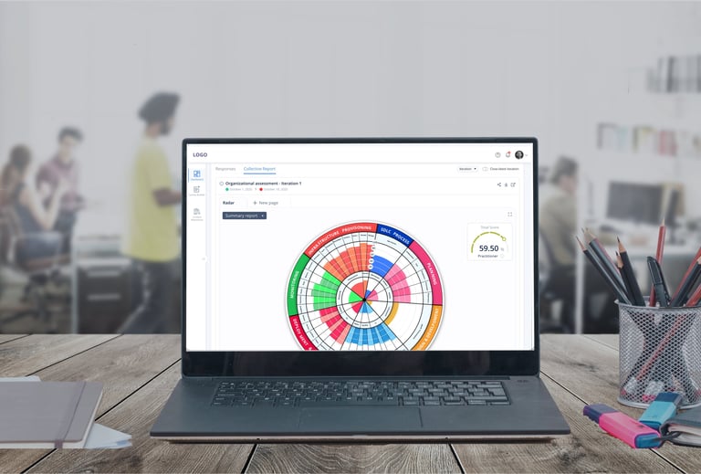
Enterprise Maturity Assessment Tool
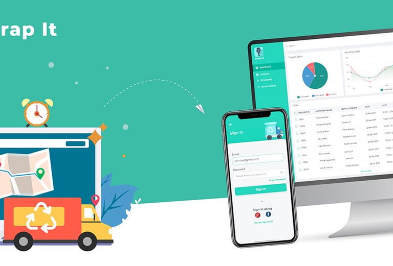
Scrap It
© 2026. All rights reserved.